On March 31st Twitter unveiled a newly designed homepage yet again. No one seems to have a problem with the new design except for me.

Here are the downsides of Twitter’s newly designed home page:
Overall
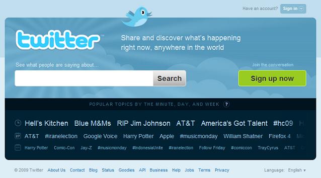
The new homepage doesn’t stand out enough like the last one, has no main focus, is too dynamic, and doesn’t focus enough on recurring users.
Top Tweets
Just like the last home page in which Justin Bieber was some how always the most trended topic, the top tweets are still only about Bieber. Also it’s too dynamic combined with the trending topics which makes the home page confusing.
Trending Topics
The “Trending Topics” along with the “Top Tweets” which rotate in two different directions could easily confuse someone on Twitter for the first time. Not only that, when you mouse over a topic, a pointless black bubble pops up with absolutely no purpose.
New to Twitter
The “New to Twitter” capsule seems to scream out that it should be placed at the same height as “Top Tweets”, it simply looks out of place. The focus on new users is way more apparent on this home page as opposed to the last one, in which there was merely a large yellow sign up button. I though preferred the last design’s sign up button because it was clean and didn’t use too much of Twitter’s valuable home page.
Sign In
The first time I visited the new home page it took me three minutes to locate the sign in button. Yes it’s the same style and placement but now it blends in to the background and is crunched up behind the “New to Twitter.”
Are you a fan of Twitter’s newly designed home page? Or not?
This is a guest post I wrote for Inspired Magazine. To see it there, click here.
You May Also Like
How to Create Engaging Video ...
18 May 2023

Designing Secure Apps: Key M ...
02 November 2021

Advertising on WeChat: A Fir ...
21 April 2021
Featured In:

Domain Authority

Popular Post


Benefits of Owning a Toyota Camry in San Antonio
May 23, 2025