Anyone who knows the basics of web usability will know that excellent navigation is an important part of a usable website. Sure, it seems like a very simple thing, and it really is. But when you think about it, navigation is really more than a list of links across the top of a page. 9HPESNCDK8VV
Here are some things to consider when working on your blog’s navigation.
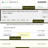
Use Numbered Page Navigation
The standard “Next Page”, “Previous Page” links sort of work, but they aren’t the best way to do it. If you have many pages at your blog, and a user has been browsing through them for a while, it can be easy for them to get lost.

WP-Page Navi
Using numbered navigation can help your users to quickly get an idea of where they are, therefore greatly improving usability. If you’re using WordPress, a good plugin to achieve this is WP-PageNavi. There is also a guide to integrate this in a theme from Cats Who Code.
Focus on Categories
Most blogs are focused on posts, not pages. Apart from possibly your “About” page, the first place users are going to look for information is in the categories. If you think you’ve got a decent category setup, it would be a good idea to draw the user’s attention to them, helping them to find what they need.
Of course, there are always some exceptions. For example, at FWebDe, very few people clicked on, or seemed to care about the category links. So, I decided to take them out in the new design.
It’s important to monitor your site, and possibly even do usability testing, to make sure you are making the right decisions.
Provide Helpful Search Results
When your users are searching for something, keep in mind that they are searching for something. Okay, that was fairly obvious. But you need to keep in mind that search results are important. A common mistake is to neglect your search results, resulting in users not being able to find what they want.
An even worse mistake is to not even have a search form at all. If you don’t have one, take a couple minutes to add one in, right now.
Don’t Rely on JavaScript/Flash for Navigation
One thing that really annoys me is when I come across a site using Flash for their navigation, sometimes only to achieve a cheezy hover effect.
Remember that not everybody has Flash. If you rely on Flash for navigation, your site will be completely useless to those without it. The same applies to relying on JavaScript, which can be disabled. Always have a fallback for those with JavaScript disabled.
Link to Other Posts Within Your Content
If your blog is about a certain topic (which it should be), you’ve probably mentioned something in one post that you’ve written another post about, before.
If a reader is interested in your post, they’ll probably be interested in a related topic mentioned in that post. After reading your post, they might even hop on over to Google to learn more about what you mentioned.
So why not add a link right there for them to follow? It is a great way for your users to find the information that they want, and it helps them to find out more about your site, possibly with them even subscribing to your posts.
Keep the Navigation in Standard Locations
This is a very simple one, but it is very important. The most important thing in usability is to keep everything where users expect it. Users will first look in the same places with the navigation in other websites, so you can keep it in those areas to help speed up your users’ interaction with your site.
The most common areas for the main navigation are across the top of the page, or in the sidebar. Pretty simple, right? It’s something easy to remember. Just make sure you don’t have a bunch of links swirling around the page for your users to chase after (kind of like those Flash tag clouds).
If you have any suggestions, or opinions please let me know below.
You May Also Like

Ways To Learn More About Who ...
03 July 2023

How to Care for Women’ ...
21 April 2023

How To Find Reliable Busines ...
25 August 2022
Featured In:

Domain Authority